Friday, December 18, 2015

Reflection of Semester

Semester In Video Production

      This semester in explore A/V was fun and full of new experiences. I got to do projects that furthered my learning in video production. I got to do projects that consisted of filming, reviewing the 6 shots and writing reflections on videos to further explain what I did good and bad in the video so I can make the next one better than the one before. The projects that were assigned were the system and procedures video, radio broadcast, a radio interview, an live ONWNOW segment of the blood drive that happened here at ONW, and our final now that is going to be on ONWNOW. (Hopefully!) Along with those videos, came a Michaela video that we had to writ an article reflection on it and what we thought was good shots and bad shots. It was a review from what we learned last year in e9.

        Some issues that happened during the process was getting everything filmed and making sure you met the deadlines on each part of the project. I was mostly kept calm about if there was something not getting done by the deadline but was really annoyed because I knew I'd have to stay after school in order to finish what I needed to do. That only happened maybe twice and I didn't want to stay so I tried focusing as much as I could so I couldn't get distracted. I mostly stayed after school to edit the videos. Even though I didn't want to stay later than an hour, I took my time to make the video as best as I could. As I watched my video, I guess it was worth the stay. Some days..

Some elements that worked out was being able to edit and get the right footage where I needed it to be. The process of getting the shots were easy. The only time I ever found it difficult was when I had to do the live feed of the blood drive because I couldn't use the tripod and could only use my body in order to get the camera balanced and stable as much as I could. The things that didn't really worked was making the scripts. It would probably take like an hour or half an hour trying to make sense of how I could rewrite some of the things I could say in order for it can go along smoothly with the sound bytes. Sometimes I could think of the scripts by myself and other times I had to ask either my peers or my teacher for help. With heir help it made the process easier and they made my video better.

Equipment:

This semester I got to work with actual cameras and not the ones I used last year which was a little camera. Had more equipment than last year. Had a camera, tripod, microphones, headphones, the wires we put in in puts to have audio. We also had microphones for the people we interview and I-Pods to put our sound bytes in. The software was hard to work with at first. I had trouble putting the camera on the tripod since you had to slid it in and make the it tight in order for it not fall off. I didn't know how to make the grid for third rule. I didn't know where to put the wires in which in put. Though the more we made more videos the easier it got to memorize how to set up all of the equipment. In the process of video making we had deadlines we had to meet and steps in order to make the video the best we could. First we had to come up with story board than, record and had to keep up with the schedule at hand. After filming we had to upload it on the computer and put into final cut pro. We don't start the editing process just yet. We have to favorite each clip and get rid of the ones that were useless to minimize out options and make the process much easier. After that, it was time for the script. This wasn't my favorite part, but since we mostly had partners I was able to make the scripts faster with their help. We made the scripts and then it was time to put our voice overs into and iPod. After all that is done we put that into final cut and start the editing process. Editing was my favorite though it did take a while. I had to make sure my story made sense and so we put it with a clear beginning, middle, and end. Once we finished editing, we made sure we critiqued our videos. This made us see their point of views on how to improve what and they caught mistakes I hadn't caught yet. After we got the results we tried making the video the best we could and uploaded it to YouTube, Blogger, and Google Classroom.

Next Year:

That was what happened this semester. I had learned how to use the camera and learn the steps of video processing. Next year we're going to do Entertainment. What I am looking forward to is making music videos and filming. What I wish to learn is how to make the effects and how to improve my videos. Other than that that's all I have to say. Hope you too learned something and have a safe Christmas and Happy New Year!!


FINAL

For our final in e-communications for graphic design, we had to make I business cards and a postcard that is front and back.
 On the left you will see my post card that has an quote that says "The Sky Is Not The Limit." I decided to do that quote to spread the message that anything is possible and there is no limitations to it. That is the front of the postcard and on the back is where you can put the information and there 4is the stamp I put that goes with the postcard.


The next thing I had to make in Graphic Design was to make two business cards. The first one had to had a photograph with my name on it. On the back it had my information and my logo. The second one had to had an original pattern with the information with my logo. These are what I came up with and I hope you enjoy them!


Monday, December 14, 2015

Painting


This is the original painting. I decided since it was almost winter I would go with a nice, cold winter atmosphere. This is the picture before painting.


         This is my after picture.

Wednesday, December 9, 2015

Palete


Imitation on famous logo.

                                                                             This is my achievement of trying to do the olympic 


logo. I think I did a pretty decent job of doing so if I may add.

Wanted pictures

This is one of my chosen ones. I did a corn and the scuba picture. It was easy enough to do.

Preferred font


My fonts for my personal logo.

Tuesday, December 8, 2015

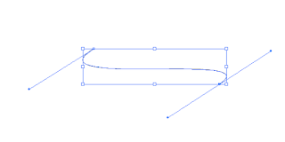
How to use the Pen Tool


I learned how to use the pen tool. With the pen tool I learned how to draw a C- shaped curve, an S-shaped curve. Really just the basics in illustrator. First you draw a straight line with the pen tool. Then drag in a direction opposite to the previous direction line. Then release the mouse button.
To create an S‑shaped curve, I dragged in the same direction as the previous direction line. Then released the mouse button.

Hope you guys enjoy my How To Tutorial on basics in adobe illustrator.

Sketches


This is how my ideas of my personal logo was being created. I started off small and made 15 sketches in total. I played with shapes and saw what I thought looked nice and clean. I started mostly with logos that contained my initials. I also tried to include the career I want to be in when I grow up. 
This is what I started putting on the computer. I was just messing around and I got critiques on the one with the cross to redo it because it either looked broken and not enough. I agree, it looks more like a hospktal logo or church logo.

Friday, December 4, 2015

Coke Bottle


This is the coke bottle with the shadow. I went and did my own thing. I didn't necessary clean it up and all. I put it Photoshop, put the grid, and started fixing any pixels that were there.

Personal Logo


This is my personal logo. In my logo I wanted something that was clean, fresh , and represented what I want to be when I grow up. I went with black and white because i either want to be a drawer or a writer and so both careers you have a black and frame to it. Black has power, elegance, and mystery.

White has the meaning of

3D Revolove Bottle

Thursday, November 12, 2015

Blood Drive Article Review


In video production, we are going o be filming the blood drive on November 13th. It is going to be a live feed and so we won't be able to pause and get the "perfect" shots we want. We go and get the best shots we can get and work with what we can. Before we can film, we have to go look for good examples of how to film and what we should see in live streams.

In this video, they filmed all the students getting their shots and taking the pints of blood the nurses need. The story told They used various shots of students getting their blood taken and include subtitles of what school it was. When they were interviewing the person, they used the 3rd degree rule of where the person should be shot and where the person should be facing.

An element that I could apply to my own work would be how I use the camera. I won't be able to use the tripod and so I have to carry the camera in a way it would be the most stable. The way they held it was by putting the camera in front of their stomach and having one hand under the camera in order to get the most steadiest shots.

A rule that I already knew about was the 6 shots sequence. I will apply his to my own work so I can get more interesting shots of the student. It will make the story flow better and with the various of shots i will be able to get more B-roll.

What the creator id good on was getting lots of b-roll. You can clearly see what is going on and the story flows naturally. They got enough b-roll to tell the story and it al ended up fitting together. What the creator didn't do good on was putting text on the screen the information of what goes on during blood drives. I found it irrelevant because you se the text with them repeating the same thing. They should just say the information while showing students getting the shots or the information could come out while interviewing a person.

Overall, it was good video. The shots were put nicely. There was only a few mistakes but in the end the video was a success. What I can learn from this video is how I should set up my camera when filming and how what different angles I could get when I go out and film.


Sunday, November 8, 2015

ONWNOW

<
In video we filmed an ONW story about another students talent. My partner was Madison Beck. In my video she is playing the violin. This video was fun to film.

The process to do this video took long. My partner and I ended up missing some days and so we had problems with the filming schedules. Though in the end we got everything settled down and got to filming. We spent time filming and got enough b-roll to spend on the rest of the video.  After filming we got and stated editing. My video had enough b-roll to fill up the space and I got the right sound effects to fill in the silence.

Overall, this was a fun project. I got to see what my partner's talent was. Even though the process was at times difficult, it was a fun and a very helpful experience. Hope you guys like it!!


Monday, November 2, 2015

Floating Mountain


In graphic design we did a floating mountain. We took the original mountain from where it's normal picture and moved it to a clear blue sky. The process was long but easy. We changed the colors and effectively photo shopped the mountain into the sky. After that we put the shadows behind the mountain and on the cloud in front of the mountain in order to make the picture look more realistic.
 
Once we had all that, we had to put our own objects into our pictures. We had to put to in them. Some did waterfalls, some just put faces next to them. I tried going with a more realistic look on one of my objects which was the moon.  I cropped the image, sized it to the size I needed it to be and placed it into the far left of the shy. My other object I had more trouble with. I went a little more of a dream view. The image was shooting stars. I tried getting the galaxy into image effectively though that wasn't the case. It didn't work as I had wanted it to but I tried the best I could.
 
 
In other words this project ended up with the next projects we do which is typography. We had to put a text into what fit into our picture. My text said "The Sky is Not The Limit." This is because I do not believe the sky is not the limit and I put the galaxy and moon to prove my point. The floating mountain was fun to photoshop and I can't wait for the next project to do in graphic design!!

Wednesday, October 28, 2015

Creative Anarchy Article Review


Today in graphic design the class read an article named "Creative Anarchy at Its Very Best." The article is broken down to 4 sections. First is the introduction and then why the design rules matter, reasons why people should embrace anarchy, and how to incite anarchy. 


The first part is the introduction. The introduction is short but it talks mostly bout how design makes life beautiful, productive, and profitable. Design is all around us and design makes the image concert and tangible. In order to create the best design you have to work and brainstorm through the idea. The job of a designer is to translate a company's abstract concepts into something everyone can understand. The design has to have meaning in it and it has to be understandable.

The next section was about the rules in design. Rules in design are exactly like normal rules set u up in society. With the rules you know how design functions. It can't all just be random designs. Though some rules are flexible and some are firm. The key is to know which rules you can ignore, which you can't ignore, and rules you can bend. To know which rules you can bend you have to know the rules first. When you're bending the rules you also have to have the condolences of the client. You have to try to convince them to add more of your ideas into their big idea. Even if it's just a little bit of details.

The next section of the article was about to think outside the box. It tells designers not to play it safe and do what every other designer is doing. It's encouraging other designers to do something differently than to go along with the group just because "everyone's doing it." When you do something differently it's unique and it gets more attention of the audience.


Wednesday, October 7, 2015

Pattern and Motif

In thins project we had to do our patterns with a motif. We then had to change the colors collar 5 or 635C Blue. It was a long process but I got it done right on time. The motif was not a repeat pattern. The motif was hard to draw. We had to adjust it to the right size. Line up all the shapes. We then had to change it to the required colors.


My pattern was difficult to think of because I had many ideas. I kept changing and changing my pattern until I finally got what pleased me the most. Here is my pattern and motif!!!

Monday, October 5, 2015

Vultures or Not?

In this project we read an article about the shooting that took place in Umpqua Community College in Roseburg, Oregon. The question in overall was to see if the reporters were being rude by asking questions at the wrong time.

The authors tries to figure out whether the reporters were being rude by asking the victims overwhelming questions at the scene of the crime instead of considering their condition before asking. The reporters started asking questions through twitter trying to get a story, but what happened next was a tremendous ruckus.

One of the author's strengths was the fact that he put evidence of how the reporters were defending themselves. He put the part that the reporters needed witnesses in order for the news to break. Weaknesses the author made was the fact that he didn't put enough commentary on the people who thought it was wrong of the reporters to ask questions at such an inappropriate time. Another weakness was that he didn't make it quite clear if it was wrong or wasn't right for the reporters to bring back the tragedy to the victims by asking questions.

The general conclusion that the author made wasn't clear at all. At the end of the article he put a quote of one of the victims confirming her safety. Even through all the commotion of what happened the general conclusion would be that the reporters could ask questions but in a light toned way.

I think that the author uses good enough evidence to where you can see both sides of the arguments but he doesn't put his thoughts and emotions into the writing. The evidence he uses persuades and people are able to see perspectives of the argument.  The only thing I don't understand is which side the author is on. He doesn't make it clear on which side he agrees with.

Wednesday, September 30, 2015

Radio Interview


In this video we were supposed to interview a peer and interview them about an important moment in their life. My partner was Olive and she told me about the time she got a dog. She explained her emotions to me and told me how much fun she spends with her dog.


Wednesday, September 23, 2015

Pattern Design


In graphic design we had to make our own ceiling tile patterns. The process wasn't at all easy and we had to work with lots of tools to finally get the image I desired. I first made a square and adjusted it to  5 by 5 in. I then put my page to be 5 by 5. the next object i made was a triangle. I made the shape into a shark tooth. I copied and pasted it. I put one behind the other and put three on each corner of the square. With that I changed the shading of the triangles to white to black. I changed the background blue. To make the repeating pattern, I went to Edit> Pattern> Make, and it made my pattern across the page.


The process of making my tiles was challenging because at first I wanted my tile to like one thing but it ended up looking like something way different. With it looking different than what  I originally had I had to play with the shapes and add new details to my pattern. In the end, I am very happy with what I came up with and hope my viewers would be pleased with my ceiling tile.

Tuesday, September 1, 2015

Michaela Video

The project was mostly to review the different shots. There was close ups, wide shots, extra wide shots, extra close up, and medium shot. It also reviewed the AB sequence.  An example of the AB sequence review would be when Michaela and her mother were talking to each other in the beginning of the video. They only filmed the left side of them both.

The story the video tells was that Michaela was no ordinary teenage girl because when she's with her dad she is a power lifter. Her father is the coach. In the video they showed us how she power lifted by showing various shots of her lifting.

An element I would use for my own projects is make the video go smoothly and clearly. It would have to have a clear beginning, middle, and end. What they showed on the video that I already knew were the AB sequence. That you have tacit only one side because if you don't the characters will flip.

The creator was really good on the shots. He had everything clear and did a good job on not cutting off anything. They did a good job on letting the story go smoothly without anything stopping or cutting. What the producer should work on is not repeating the same shots. Have the same number os shots in the video. The video was well mad. It went smoothly and it as well put. It showed us how Michaela practiced and showed us when she had competition.


System and Procedures Video

In video production we had to make a system and procedure video. The audience was mostly the new students, new parents, and just in general people who didn't know how the school works. In my video we did a "good version, bad version" of how to ask to go to the bathroom. The video had to have no voice overs, professional music, and it has to have a clear beginning, middle, and end. The video was very to fun to do and I enjoyed it very much.

Friday, August 28, 2015

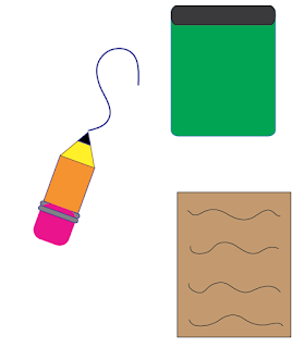
Back To School Pencil


This week in graphic design we had to make our own pencil. It was all base in the mood of going back to school. Our assignment was to draw three things on Adobe Illustrator. We had to draw our own basic, colorless pencil. After that, we got the chance to make our own pencil that we can make any size and color. With the pencil we could draw three other objects next to it. The third thing we did on Adobe Illustrator was to draw what we could draw on our own designed pencil. 


This is the pencil I designed. I made it seem like any other pencil. Basic. Next to the pencil I drew and pencil cup and a piece of paper. I used the color and I adjusted the colors to make it look realistic like the real objects. There are two other objects I made with the pencil and the other one I count is the squiggle line the pencil made. 


This is the first pencil I made. The pencil as you can see has no color and it had to be a certain size. Since it has no color you can see that it wasn't just two rectangle and a triangle I used to make the pencil. I made two rectangle and adjusted them to the size they are supposed to be. The rectangles make up the body of the pencil. I used the rounded rectangle tool to make the eraser. I then made two triangles. One for the led and the other to make the end of the pencil. The shapes were all adjusted using by either changing the width and height or pressing on the shape and pressing the option button. 


The third thing I had to draw was what I could draw with my designed pencil. I drew a flower. I drew a straight line and curved it. I then drew the petals and duplicated them. I put them all around the flower and angled them the way they are supposed to be facing. I then colored the middle part of the flower yellow and the leaves green with white. The petals are mostly with green on te sides. I then added a companion to the flower. I drew a butterfly since most butterflies are around flowers.


Thursday, August 20, 2015

What Is Graphic Design?


What Is Graphic Design


            What is graphic design? Graphic design is the art and skill of combining text and pictures in advertisements, magazines, and books.  People can create something that is pleasing to the eye; something that gets the attention of the viewer. The design can't be just random or look cool, it has to has to have meaning and it has to work with the rest of the project. It's a creative career that finally rewards you for all those doodles you'd make in class. 


           I like graphic design because I like to draw. With the doodles I make in my sketchbook, I can put them on the screen and work with different colors and designs.  Graphic design gives me the chance to express myself and it also gives me the chance to display my work to audiences. Another reason why I like graphic design is because I want to be journalist. As a journalist, I will be able to to design my own designs with the story I am making. Graphic design would be with me for the rest of my life and I am grateful I have the opportunity to get to work in e-comm program.


http://quickstreammarketing.com/graphic-design/


Monday, May 18, 2015

Final


          On our last assignment in e9 we had to get in groups and come up with our very own marketing product. The process was frustrating, fun, and it was a difficult yet easy task. We had rotations: graphic/web design, video, and animation. We were all in charge of doing our own task. Coming up with product was the hard part, the rest was easier. Though it was easy, my group bumped heads along the way. Some days it was challenging for us cooperate and some days we got along perfectly well. When it was time to present our products to the rest of the groups, each person in my group knew exactly what to do when introducing our products. The project as a whole was a good experience and I enjoyed it very much. I learned to cooperate and to just cool down when we disagreed on terms. My team showed me how to make better features on my part of the project which was very helpful and it made it a success. What i would do diffrently next time is make my own work better. I could add more colors here, be more organized and make everything look much cleaner. The project helped in many ways and I'm glad we did this for out last time in e9.


        When I was in graphic design for the rotation when we were working on the project, I was in charge of making the ad. I used Adobe Illustrator. I got a visual of what i wanted the bag to look like. I wanted to make it simple and I wanted the font of the words to be simple yet you can also see it and wont take away the attention of the bag.


         When I was in animation working on the project i was in charge of making the packaging. Since it was a bag we were making i decided it would come in a box. I made the sure i got the color blue and more dark colors. This is because the logo for our group has just different types of blue and I wanted the packaging to go along with the logo yet when i put the logo on the corner of the box, I wanted it to stand out.


          When I was in video everyone had to do his or her own video. When we were filming I was one of the actors and I came and gave everyone sandwiches from The Bag. When we were done filming we all got the clips we needed and started working on our own videos. I used the tools i needed and even though we chose Alana's video, I still enjoyed making my last video here in e9.When I was in video everyone had to do his or her own video. When we were filming I was one of the actors and I came and gave everyone sandwiches from The Bag. When we were done filming we all got the clips we needed and started working on our own videos. I used the tools i needed and even though we chose Alana's video, I still enjoyed making my last video here in e9.

Thursday, April 30, 2015

We are making a product in e-comm! The students in e9 are put into groups and each group is responsible to come up with their own product.  My group and I came up with the product "THE." It stands for Technology Helps Everyone. "THE" is a bag that when you need something, all you have to do is reach into the bag, ask for what you want, and then you will pull that exact object out of "THE" bag! So in order for people not to be able to abuse the product, the product comes with limitations. During the commercial, you saw things you can pull out of "THE" bag. "THE" can get you anything from money to trophies to even sandwiches. Remember though that "THE" bag does have its limits. You have to treat it carefully, but make sure to show it off in the streets nd even help your friends when they are hungry. Get "THE" bag, it sure does help everyone.


Wednesday, February 25, 2015

Photoshop Projects

Photoshop Project 2: Monarch Butterfly
We had to make a butterfly in Photoshop. The only colors the butterfly originally started with was orange, black, and white. What we had to do was make the butterfly's wings different colors. To change the colors we pressed Image>Adjustments>Hue/Saturation. to make the wings all fluttery you pressed "B" to get the brush. You then pressed option while clicking on a spot on the butterfly. Then you just click and drag where you want it to flutter.


Photoshop Project 3: Northwest

What we had to do in this project was put the word Northwest with it showing the school in the background.  We start with the background we used in project 1 and then we just go to the text tool. We adjust it so the text can go horizontal. We wright the text and change the size so it can fit the whole picture. We select everything but the word and then change the color go the selected area adjusting the opacity.


Project 4: Collage

What we had to do was photoshop the ravens head, a hall, the administration, and information areas into the school. We had to cut out the shape of the ravens head. We had to select all, and then copy it into the school. Then we had to change the flu of all the pictures to lighten the stroke of them.


Project 1:Compass
We had to put a compass and the put the letters ONW onto the school. We selected the compass with command A and then did command C to copy it. Then you had to click the text tool and write the letters ONW and change the color with the fill button.


Thursday, February 19, 2015

My Cube


        In this project we had to make a cube. The cube is 3-dimmensional and it represents my journey here in e-communication so far. The classes I had were animation, film, and right now I'm currently in graphic design.

        My first stop was animation. Reasons I enjoyed the class was because it was making cartoons. We put in sound effects and made our very own "show," even though it was just one episode. We also got to make our very own dream house. It gave me some experience and I'm glad I got to be apart of it.

        My second stop was film. I learned how to use the cameras and learned the basics of filming. Even though sometimes the class got frustrating, it was worth it in the end. It was also an amazing when I compared my first video with my last video and I saw the improvements. I'm glad I had the opportunity to take the class and learn about film.

        I am currently in graphic design. In this class we learned about colors, shapes, types of fonts, and the organization of websites. How they make it all seem very neat and clean. We got to use Illustrator and we are currently in Photoshop. This class has been fun so far and I can't wait to learn more.


Friday, January 30, 2015

My Personal Logo


In this project we had to make our own personal logos. Our personal logos had to represent us and have a greater meaning behind it. Everything in the logo is very important; color, shape, size and even font.

My logo consists of my name in a rectangle. I put my name on a grayish/whitish rectangle to make it stand out more. My name is being showed as 3-dimmensional. I tried making it as simple as I could because I just think that the more simple, the better.

I chose these colors because they looked nice and fresh. They also went with the background they're on and I thought it looked good. The font is Fortuna. The font is beautiful; and it put everything together.

This would be my logo because it's simple. The colors look nice and it's not too complex and not crazy-looking. 


Wednesday, January 28, 2015

My Pathfinder Shape


This is my shape i made using the pathfinder tutorial. I have the star in the center covering one corner of each square. The shapes i used were rectangles, a star, and arced lines.  The rectangles were sent to the back and i drew arced lines and sent them to the front. The star I put in the very center and had it overlap one of the corners of each rectangle.

Friday, January 23, 2015

My Personality Font


My personality font is Pistilli Roman. My four words that describe me that got me this font are emotional, traditional, assertive, and disciplined. Pistilli is emotional because it's arousing. How it relates to my personality is because when I saw the font it aroused me to it. It held my interest. The next word is traditional. I like to keep things old fashion. I am a big believer of old sayings. The next word is assertive. Assertive means having or showing a confident or forceful personality. I'm not shy at all and when I need to find answers, I will speak up and ask. Pistilli roman's font isn't hard to miss. When you see it it's hard to ignore it since the majority of the letters have swirls. It's out there. The final word is discipline. The font isn't too crazy. It has a hint of gentleness in it's swirls. How it relates to my personality is that I know how to handle situations as best as I can. I have my feeling all controlled and I try to keep everything as gentle going as possible.

Wednesday, January 21, 2015

My Colorful Color Wheel


Each color represents a mood.  The mood for red shows passion. An example would be Valentine's Day. Next is yellow. Yellow represents warmth. In my shower gel I had Spongebob and Spongebob is a happy fellow. Next is Orange. It represents friendliness. An example would be Garfield. Even though he is lazy, he shows true friendship. Next is blue. Blue represents trust. Like in Nemo, Dori was trustful companion. Lastly. green represents peaceful. Examples would be grass and summer, when things are peaceful.

Wednesday, January 7, 2015

What is Graphic Design?

Graphic Design is the methodology of visual communication, and problem-solving through the type, space, and image. It is the art or skill of combining text and pictures in advertisements, magazines, or books. Graphic design has to solve a problem.  Graphic design is all around us actually. It uses both words and images to convey a message.